Like Larry the Flying Guy on Facebook!

Tuesday, April 9, 2013

U.S. Weather Patterns: The really big picture

One of the things that I like most about weather videos is that they really emphasize the point that weather is an extremely dynamic process. The atmosphere suffers from the same curse as Sisyphus, condemned to ceaselessly roll its thermal stone up the hill only to watch it roll back down every time. In order for the weather to rest, we'd need two things: for the Sun to burn out and for the Earth to stop rotating. Unfortunately, we'd all be permanently resting if that were to happen, so weather is as much a blessing as it is a curse.

The video below has the weather for all of 2012 as one continuous movie. Don't get bogged down in the specifics; concentrate on the general patterns of movement and how they change as the seasons progress. While the radar data is the big frame in this movie, keep an eye on the visible satellite image (bottom right) for a good view of where the atmosphere's signs are better seen. After all, there's more to weather activity than just rain or snow.


The clouds, how they move, and where they form (or, almost as importantly, don't form) give away characteristics of the air mass they are a part of. These air masses move in somewhat predictable patterns and have generally similar sources. Now that you've watched the results of what happens when air masses move and collide, watch the same time-lapse period in surface analysis charts (a technical-sounding term for something you've probably been familiar with since you were a kid: it's just a weather map). As before, don't get wrapped up in the specifics of what each and every little squiggly line is doing, because they come and go too quickly to focus on details. Concentrate instead on the general movements, shapes, and patterns of the blue and red lines and the H and L pressure systems. After the video, we'll go into a bit more detail, but for now, get a feel for how air masses move:


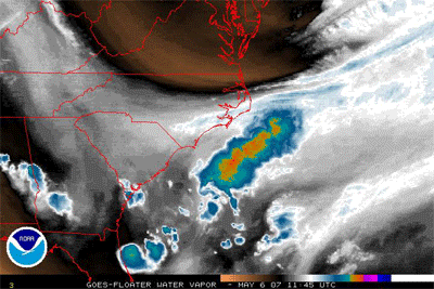
Hurricane Sandy enters at 8:02 (bottom right), followed by a Nor'easter at 8:23 (right center).

What we see overall are waves of cold air originating from the top/top-left of the chart and flowing to the bottom right. These waves look a lot like waves hitting a beach, and they tend to have a high pressure system right behind them. As the season goes on, we start to see more waves of warm air coming up from the bottom-center and flowing up to the north/northeast. Depending on the timing of the waves, the cold air masses flowing from the north tend to smack right into the warmer air flowing from the south. When this happens, a stationary front tends to develop, which often (but not necessarily) spawns a low pressure system. An example of an impending collision and its result is in the next two charts:

Cold front extends from N. Texas through Oklahoma, Missouri, Illinois, Indiana, and Michigan.
Warm front extends from N. Texas down to the middle of the Gulf of Mexico.


Twenty-four hours later, the fronts have collided and merged into a stationary front along the N. Texas-Oklahoma-Arkansas-Mississippi line. The cold front is trying to push on down south, while the warm front is resisting its movement.
It's no coincidence that air masses moving in a line are called "fronts" and masses of troops moving in a line are called "fronts". The Norwegian meteorologist Wilhelm Bjerknes noticed the similarities between the two concepts and came up with the term "front" in 1919, with World War I fresh in mind.

Where fronts do battle, weather takes shape. In general, advancing cold fronts bring narrow bands of heavy rain and/or thunderstorms, while warm fronts tend to bring milder rain that lasts longer, and possibly fog up the place. Tornado Alley is where very dry cold fronts coming from the west meet with warm, moist air coming up from the Gulf of Mexico. A battle between two very distinct fronts like that brings about extremely severe thunderstorms that can spit out tornadoes. A classic example of this can be found over Texas in this chart:

The air flowing from the south up from Mexico into Texas is colliding with air over Kansas and eastern Colorado. "Squall line" is something you definitely don't want to fly through: there were 4 tornadoes in Colorado and 1 in Kansas on this particular day. (Fortunately, none of them struck any populated areas.)


If you recall the summer of 2012, we had a rather long heat wave for a good portion of June and July. Go back to the surface analysis video and watch it starting at about 4:20 until 5:45. Pay attention to the high pressure system(s) that tended to lodge right over the Great Lakes and were hard to budge, and even when one did get dislodged, another one would come along to take its place. These high pressure systems tended to block or interfere with frontal movement, and the warm air coming up from the south got to come up further than usual for longer than usual. Also, high pressure systems tend to put a "lid" on the atmosphere, preventing warm air from rising as much as it normally would, leaving us to bake like a dog in a sunny car with the windows rolled up. I tend to look at high pressure systems like this as big sumo wrestlers that come in and plop down, daring anything to move them and keeping anything they're sitting on from getting up.

The stationary front farther to the north than normal is pictured nicely here in the picture from June 20th, 2012 below. Note the extraordinarily-long stationary front that extends all the way from California to Michigan. Combine that with the high pressure system sitting over West Virginia using its clockwise flow to scoop up warm air from the south and you have a recipe for some long, hot weather, which is exactly what we got:

That H over West Virginia is just pulling warm air up to the Midwest like a conveyor belt, with nothing to interfere with it thanks to the stationary front cutting across the country.


One of the greatest visualization tools I've ever come across for seeing true restlessness in action is the Wind Map at Hint.fm. Just looking at the winds for whatever day you happen to go there is mesmerizing enough, but check out the winds for September 19th, 2012 and then compare the scene on this surface analysis chart

Static chart vs. dynamic winds
The clockwise swirl around Columbus makes it easy to predict there's a high pressure system somewhere over Ohio, and according to the chart on the left, there sure is. With a huge patch of equal pressure extending all the way down to the other high pressure system on the Louisiana-Arkansas border, we can predict that the winds would be pretty light for a long stretch. Abracadabra! We look at the map on the right and sure enough, there's a dark streak that follows that very course. On the left chart, we can see a low north of Minnesota, which means that swirl at the top center is rotating counterclockwise. Uh oh: we have a high pressure system on one side and a low pressure system to the west of it. That means that we're going to have a lot of air sandwiched between two spinning wheels, so it's going to get sucked in and speed up like a baseball in a pitching machine (short video below in case you don't know what a pitching machine is). Sure enough, we look at the wind map and there is a big, hairy patch running north-northeast right up those isobars. Yay us!


Great. So we've established that air masses move in fronts and have general patterns. So what? Well, most of the weather that will affect you as a pilot happens because of or along these fronts. By having an idea of what to expect from them, you can have a good idea of whether to head out to the airport and fly somewhere or to stay at home and catch up on your blog reading. While you can't change the weather, you can change the level of risk weather presents to you by understanding its behavior.

Thursday, April 4, 2013

Subtropical Storm Andrea: A curiously clear look at the atmosphere at work

Before we get started, let me apologize if this entry looks like a poorly-constructed, intensely-annoying moving pictures website from the golden age of free webhosting (Tripod, GeoCities, etc.) It can't really be any other way, unfortunately, because the whole point of this post is to get into how weather is a dynamic process, not a static bunch of squiggles and lines on a chart.

Andrea 2007 was pretty banal as tropical activity goes. It wasn't particularly organized, it didn't have much of a huff and puff, and it generally wandered around over the ocean aimlessly and harmlessly. It was, however, a particularly photogenic storm. Check out the water vapor imagery below as a dry (the brown area) fat cold front barges its way south, pushes the moist tropical air out of its way, then coils around and envelops little Annie:

Radar loop from 1145z May 6, 2007 to 0115z May 8, 2007 (Wikipedia)

Huge bulging masses of air pushing other air masses out of their way aren't rare at all, but a mass that is so clearly defined as this one is relatively rare, so I've slowed this down and doubled its size below so you can more clearly see the progression:
Same loop as above, slowed down and enlarged 2x (Created by me with two lines of imagemagick)
I pulled some historical analysis charts from NOAA by going to http://nomads.ncdc.noaa.gov/ncep/NCEP, selecting "United States Analysis" and then "United States Surface Analysis", then selecting the dates. I created another animated GIF with the surface analysis for the same time as the satellite images above so you can see what the strong low pressure system looks like on a chart and so you can watch that fat cold front march along to the south and start hugging little orphan Annie:

What I find as amazing as the clarity of that animation is that the phenomenon that started the whole process in motion was approximately 1500 miles away! Check out the first image of the surface analysis (which is posted by itself below):

Surface Analysis chart for 0000z May 6, 2007
See the high pressure ( H ) system on the east coast of James Bay in Canada? (It's at the top center-right; James Bay is the "tail" hanging off of the barely-visible Hudson Bay. It has a bold "1038" just to the right of it.) That H is the bulldozer that started the cold front in motion. Look at the animated chart again and watch the cold front start forming over Pennsylvania and central Ohio, then march mercilessly south, pushing everything else out of its way--including another cold front that wasn't moving fast enough. Once the east edge of the front's depiction line connects with the L off the coast, you can watch it start winding around it and creating an occluded front where Annie is. That L is about 1500 miles away from the H! It's not a coincidence that the Butterfly Effect was discovered by a meteorologist, although in this case we don't have a little insect flapping its wings: we have a big, fat, cold high pressure system plopping down and making a splash like a fat guy doing a cannonball into a continent-sized pool.

Most people tend to think of weather as local: if it's raining on their head, it might as well be raining everywhere, so local is about 10 miles. Pilots have a different definition of local, since we can be in another state in an hour, so we look at local as about 100 miles. As this example shows, weather patterns have yet another definition of local, which is about 1000 miles! Believe it or not, the weather in Ohio is heavily influenced by what is going on in the Gulf of Mexico south of Louisiana. The wind currents there can shoot bad weather up our way like a baseball being shot out of a batting cage machine, they can deflect it to the south of us by tugging a front down, they can intensify or interfere with fronts coming east off of the Great Plains, or any number of things. My next post will get into those large-scale patterns with yet another animation.

I'll leave you with another pretty picture of Andrea. This one even has some huge smoke coming from some brush fires in northern Florida to make it even more interesting:

Subtropical Storm Andrea on May 10, 2007 (Wikipedia)