 |
| Excerpt from VFRmap.com. Click image to embiggen. |
So far, so good. However, if you looked closely at the airport at the bottom right, you may have noticed that its data block also says 80, meaning its longest runway is 8000 feet long, but it's not in a circle like it's supposed to be:
So why do these airports both have 8000-foot runways but different symbols? How can two things be the same and different at the same time?
That's because of the layout of the three runways. Since they're fanned out and so far apart, even though they're less than the 8069 round-up point, they still wouldn't fit inside the biggest circle chartmakers use. Therefore, they get drawn individually.
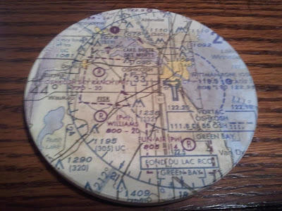
There's another example of this same thing in action. This time, it's at one of the most famous airports in all of general aviation. In fact, it's so famous, my coffee mug is sitting on it right now:
 |
| I obviously drink a lot of coffee. |
 |
| Sectional chart excerpt from SkyVector.com. |
I won't go into the other exceptions that make second part of the Sectional Chart User's legend, "some multiple runways less than 8069'", necessary:
I will leave you with just one more, which is Evansville Regional Airport in Indiana, which is 8020. That saves the rest for you to tell me about in the comments, since I don't want to hog all the fun. If you find one that is less than 8000 feet, be especially sure to share those, too!
Also, I will leave you with this brainteaser: it is possible for an airport or airports with hard runways between 1500 and 8000 feet that would fit easily into a circle to not be put into one. These airports also do not meet the exception in this post. Why do some charts show almost all public, hard-surfaced airports on them without ever using a circle? Share your answer in the comments. The first one to get it right wins a pat on the back!


No comments:
Post a Comment